It’s hard to deny that a logo is the “face” of a brand. It should convey not only the company’s services, but also its values, and at a glance “convey” the tone of the company’s communication with the client.
Our story is no exception. In this case study, we’ll tell how we redesigned the logo and created a unique corporate identity for Dva Bileta, a Ukrainian service for booking and purchasing tickets from Ukraine to Europe and vice versa.
The CMO of the project is Serhii Soloviov.
The service included logo redesign, development of the company’s corporate identity, and creation of the company’s brand book.
Case navigation:
- Identification of project needs and features
- Marketing research
- Logo redesign and corporate identity creation
- Conclusions
Approximate time for case study — 7 minutes
The first stage. Identifying the needs and features of the project
We met the Ukrainian service Dva Bileta in 2022.
Our client provides services for booking and redeeming tickets for bus trips from Ukraine to European countries and from Europe to Ukraine. It has distinct advantages that set it apart in the market:
- a company with over 14 years of experience in the transportation sector;
- employees with over 30 years of experience;
- individualized route selection for each client according to the request and budget;
- flights with the possibility of traveling with pets;
- working exclusively with licensed carriers under official agreements.
We started cooperation in full, as the client requested a comprehensive service — a remote marketing department. The main request was to increase leads and create systematic marketing that could provide this very lead generation.
As always, we started our cooperation with a consultation, during which we got acquainted with the project, formulated the goals and objectives of cooperation, and also proposed to create a strategy for solving them.
During the consultation, we realized that to increase the number of orders, firstly we needed to update the image of the brand itself: redesign the logo and create a corporate identity, and then start lead generation.
Therefore, in this case study, we will tell you directly about the experience of creating a unique corporate identity and logo redesign.
The strategy for updating the brand image consisted of the following:
- market research and competitor analysis;
- redesign of the logo;
- creating a corporate identity;
- creation of a brand book;
- creating a website following the corporate identity;
- updating social networks following the new corporate identity.
Stage two. Marketing research
We engaged a team to work on the Dva Bileta project:
We conducted in-depth research and learned:
- how the client’s business is organized;
- the target audience and products of the company;
- how visual elements are perceived by the service’s customers;
- how the logo and colors convey brand values;
- main competitors: what is common and what is different. What you need to do to be different from competitors.
Stage three. Logo redesign and corporate identity creation
Logo redesign and corporate identity creation
Visual elements of a brand are one of the primary, recognizable parts of marketing. The logo is the company’s ” face”, so we suggested updating it, as the outdated and irrelevant design is out of sync with the positioning of a modern ticket booking service.
The client agreed and filled out a brief, a document that lists all the wishes for the future logo. The brief is the main guideline for the designer in the project work.
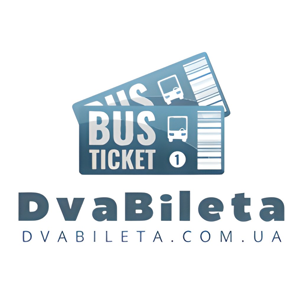
We offered several options for the logo:
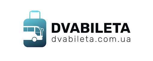
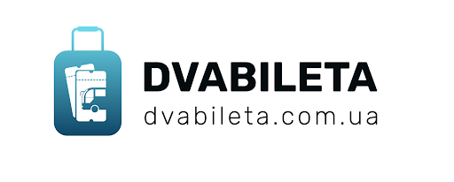
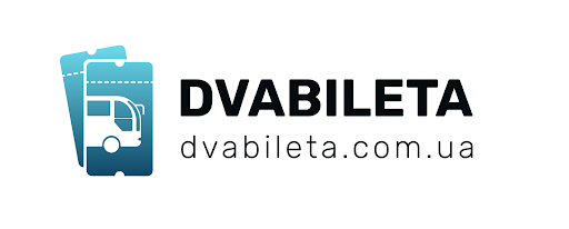
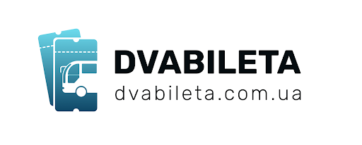
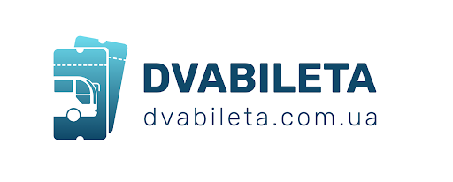
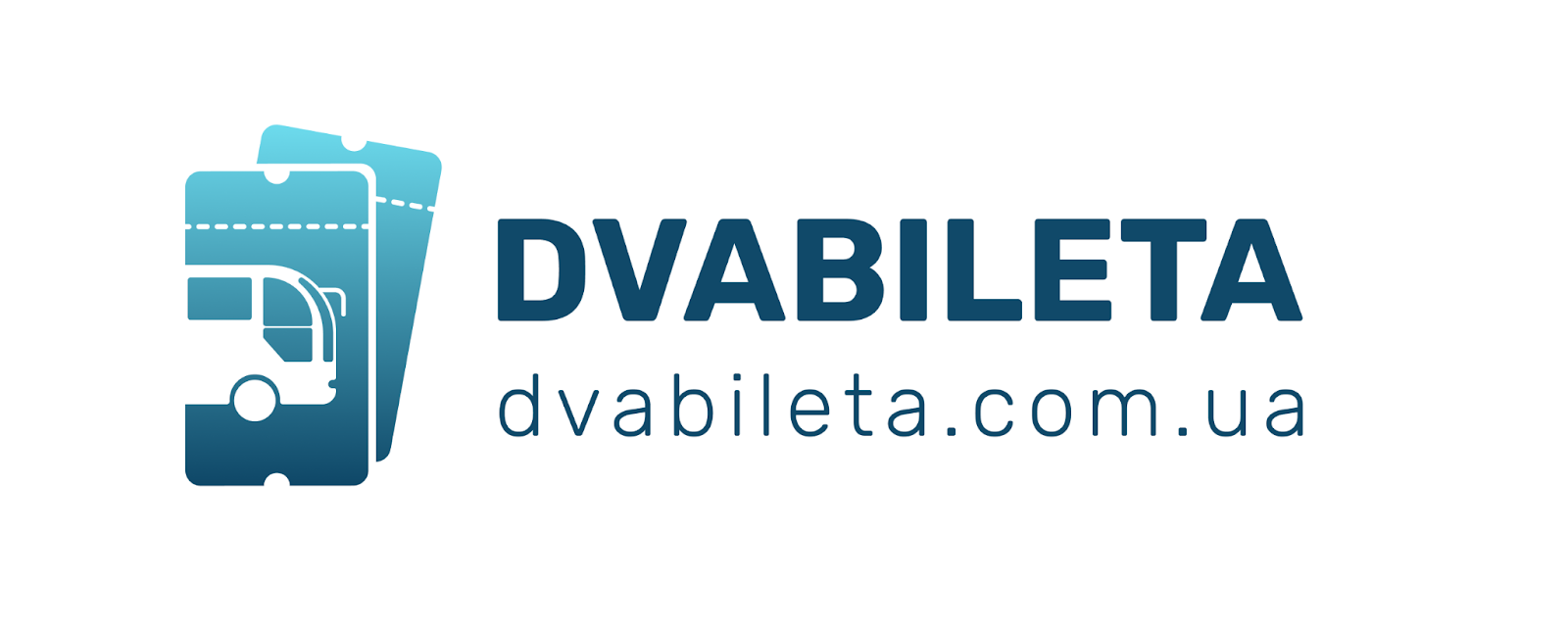
Together with the client, we decided on the following option:
Creation of a brand book
A brand book is a company document that describes visual elements, the main attributes of a brand; recommendations for their use, and examples of how to use graphic elements are strictly prohibited.
The colors of the service were chosen according to the brief and the client’s wishes:
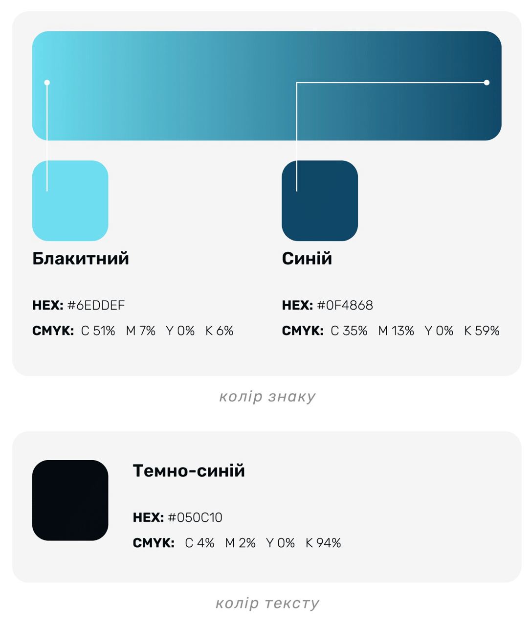
When choosing corporate colors, we were guided by several important factors:
- the client’s wishes, which were specified in the brief;
- the psychology of color, as people associate blue and its shades with something calm and safe. The use of blue for logos subconsciously evokes a sense of trust and calms clients. You can read more about the psychology of color here.
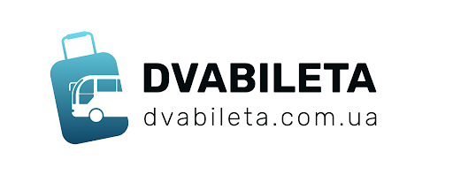
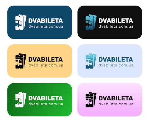
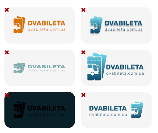
We determined the acceptable variations of the logo and its unacceptable modifications.
We defined the font and worked on visualizations.

Results
We updated the project’s image by creating a modern logo and corporate identity, which became the basis for branding and visual design of the future website, social media, and creatives for advertising campaigns.
By the way, in this case study, you can read how our team set up advertising for Dva Bileta and understand how branding and graphic elements are interconnected with lead generation.
This is just the beginning! We continue to cooperate with the client, so we advise you to subscribe to our social networks and join our email newsletter so that you don’t miss the most important news from the world of marketing and Solve Marketing!