Business enquiry
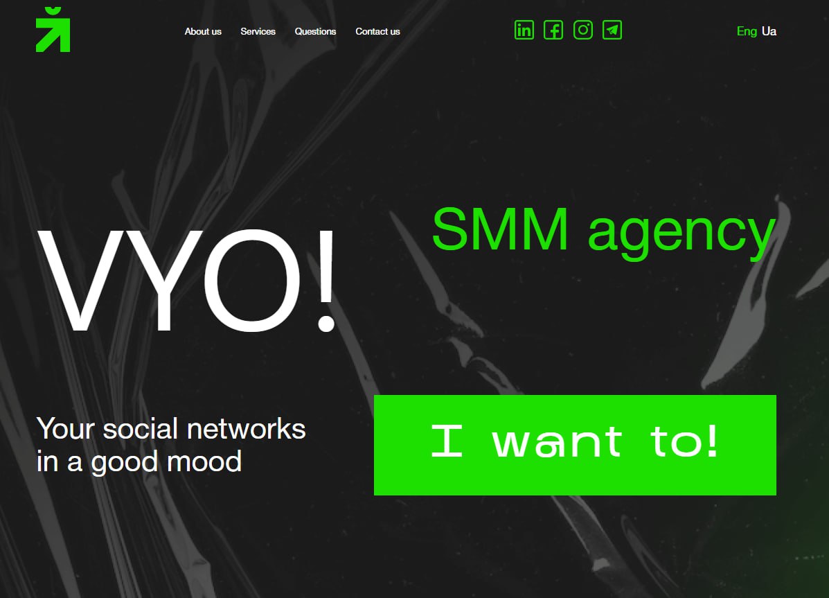
VYO! Agency is a creative SMM agency that promotes brands through humour, meme culture, and emotional content. Their strength lies in creating a recognisable communication style that forms an emotional connection between the brand and its audience.
At the start of the project, the team faced three key challenges:
- Create a website that immediately conveys the brand’s character: drive, boldness, lightness.
- Visually and conceptually differentiate ourselves from typical SMM agencies.
- Implement the project within a short timeframe for further scaling through partner networks.
The SMM agency niche is oversaturated. Most websites in this category have a similar structure:
– a standard first screen with general promises;
– an “About us” section with generic wording;
– a list of services without a clear funnel logic.
As a result, the user does not see any difference between agencies.
For VYO Agency, it was crucial that the website became an extension of their creative DNA while demonstrating consistency.
The role of the marketer and the design stage
We view the website as part of the company’s marketing system. Its structure is based on business goals, customer engagement models, and audience decision-making logic.
Before starting development, we analyse the niche, competitive environment, user behaviour, and traffic entry points. This allows us to lay the foundation for the correct structure and interaction scenario for the website.
We work in sync: marketer, designer, and technical team. This approach ensures consistency in decisions and reduces the number of iterations.
I. Analytical base before launch
Despite the tight deadline, the project began with research:
- analysis of competitors in the SMM and creative agencies segment;
- studying visual patterns in the niche;
- analysis of competitors’ tone of voice;
- identifying market saturation points;
- researching the expectations of the target audience (B2B, educational projects, eCommerce).
The peculiarity of this niche is that most agencies declare “creativity,” but their websites look the same. Visual noise creates a paradox: agencies that sell creativity often do not demonstrate it in their own positioning.
💡In highly competitive niches, a website becomes a tool for differentiation. For creative and SMM agencies, the balance between emotion and professionalism plays a special role. Content and visuals should work towards business results and build trust.
Websites that attract affiliate or cold traffic require a clear script structure. Users receive answers to key questions in a logical sequence and see a clear next step.
The marketer determined:
- where the difference needs to be emphasised;
- what level of expression would be appropriate;
- how not to cross the line between humour and professionalism.
Sign up for a free consultation! Receive a preliminary audit of your current structure or recommendations for your future website, taking into account your niche and goals.
II. Website structure as a decision-making scenario
Since the site had to work with a cold partner flow, the structure was based on the principle of quick reading of key meanings.
Each section responds to a separate level of inquiry: emotional, rational, and trust-based. The structure takes into account the F-pattern and Z-pattern principles of page scanning. This allowed us to place key messages in areas of maximum attention.
Each block has a clear goal — to increase scroll depth, retain attention, or lead to an application. We have incorporated CTA repetition through confidence intervals, which allows us to work with different types of users.
First screen
The first screen was designed with the three-second rule of perception in mind. The user immediately gets an answer to the questions: who you are, what your strengths are, and what they should do next.
Various offer formats were tested: emotional, hybrid, and structured. The chosen option combined the brand’s character with a clear business proposition.
CTA is designed as a soft conversion trigger that lowers the barrier to first contact.
The marketer determined:
- format of the offer;
- balance between humour and specificity;
- clear conversion trigger.
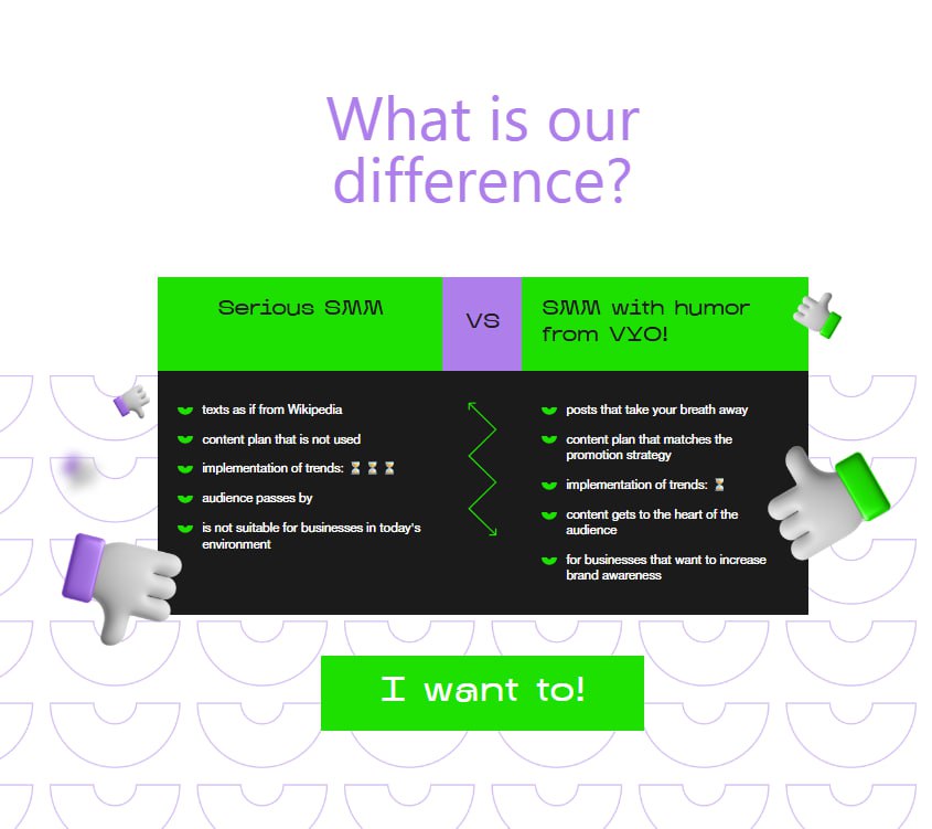
Differentiation block
The block with the comparison “Serious SMM / SMM with humour” serves to position the brand through contrast.
Structurally, it is:
- shows the problem with the market;
- explains the agency’s approach;
- translates into business benefits.
This format allows you to quickly explain the difference without lengthy descriptions.
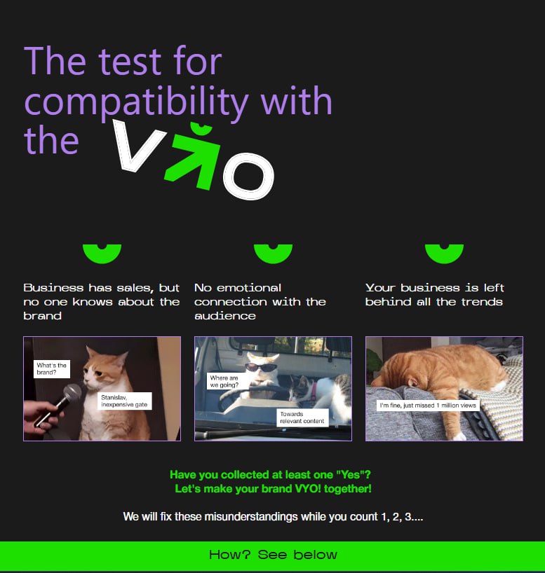
Audience pain block
The section with questions (“Sales are there, but the brand is unknown,” “No emotional connection,” “Business outside of trends”) works as a diagnostic tool.
The marketer incorporated a self-identification mechanism into the structure: the user recognises their situation and moves on to the solution.
The button after this block lowers the barrier to contact.
Service package
The “Our Services” section is structured according to the logic of the full SMM cycle:
- strategy;
- content creation;
- bloggers
- advertisement;
- communication;
- analytics.
Services are structured according to the principle of full cycle social media management: from strategy to analytics.
Stages of work
The “Work Stages” block is divided into one-time and monthly processes. A clear division into one-time and regular processes allows the client to understand the points of control and responsibility. This reduces uncertainty and creates a transparent model of cooperation.
The marketer provided a clear explanation of the process before the sale began.
Cases and team
Case studies and teams reinforce trust through social proof and personalisation.
Interactive photo captions create a sense of live contact.
FAQ
FAQ addresses common objections:
- approach to humour;
- social networks;
- measuring results;
- owner involvement;
- filming.
This reduces the number of barriers to application.
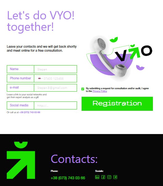
Final conversion block
The contact collection form is integrated with a free consultation and expert analysis of social networks. The final block works as the conclusion of the scenario: emotion → arguments → trust → action.
Since users arrive without prior familiarisation, the structure is built on the principle of quickly establishing trust. In the first 60 seconds of interaction, the site answers key questions: competence, approach, process, and result.
The structure of the website allows you to work with different levels of customer readiness — from initial acquaintance to decision-making. This ensures stable conversion logic and the ability to scale through advertising and affiliate channels.
III. Content strategy
The content was created with different levels of perception in mind: the headline is for quick reading, the subheading is for clarification, and the text is for deeper understanding.
The structure uses the principle of micro-promises: each block provides specific value or answers a query.
Content in creative niches is a risk zone. Excessive humour can devalue expertise, while excessive seriousness can destroy character.
The marketer formulated the principles:
- humour always works for business objectives;
- emotion is reinforced by responsibility;
- lightness does not exclude analytics.
The texts were developed in parallel with the visual concept. No block was inserted formally — each had a clear function in the funnel.
We also adapted the texts for partner traffic, where users may not be familiar with the brand beforehand. Therefore, the communication contains markers of trust and structure.
Design as a strategic tool
In this project, the visual component became a tool for managing brand perception. The design shaped first impressions, set the level of trust, and determined positioning in the competitive environment of creative agencies.
I. Formation of the design concept
The design concept was developed based on a marketing hypothesis: the website should convey both creativity and consistency.
In addition to the basic parameters (colour temperature, expressiveness, and graphic character), the following were determined:
- acceptable level of visual load;
- content rhythm and text/visual ratio;
- typographical hierarchy for quick scanning;
- contrast zones for attention control.
The first screen was tested in several stylistic interpretations with a focus on conversion and readability. We evaluated not only aesthetics, but also the speed of reading the offer.у.
The key task was to create a website that:
- builds recognition from the first contact;
- maintains structure;
- supports brand identity in the long term.
The visual identity became an element of strategic differentiation and the basis for further brand scaling.
II. Complete UI design
The UI design was developed taking into account user behaviour patterns.
The composition of the blocks is based on the following principles:
- visual hierarchy;
- repetition of key triggers;
- balance between text and space;
- scroll behaviour control.
Microinteractions and animated transitions were used for:
- strengthening brand dynamics;
- maintaining attention while scrolling;
- creating a sense of a “live” interface.
Adaptive solutions were designed with separate UX logic for different devices.
III. Mobile logic
Since part of the traffic was planned to come through affiliate links and social networks, the mobile version received special attention:
- the order of blocks has been optimised;
- CTA visibility has been enhanced;
- the navigation has been simplified;
- the character of the brand has been preserved.
Also taken into account:
- the reach of the thumb;
- reducing the time to the first CTA;
- compactness of key arguments;
- fast loading in mobile network conditions.
Mobile UX has been optimised for quick decision-making.
Technical implementation
IV. Preparation for development
Before layout, complete technical documentation was prepared, including:
- design system for further scaling;
- UI kit with reusable components;
- description of interactive states;
- event map for analytics.
This allowed us to synchronise the design and technical teams and minimise risks during the implementation phase.
V. Layout and integration
The layout was made taking into account:
- adaptability at different resolutions;
- Core Web Vitals optimisation;
- minimising unnecessary scripts;
- correct operation of animations without loss of speed.
Integrating CRM and analytics allows you to:
- track lead sources;
- analyse user behaviour;
- optimise conversion points;
- scale advertising campaigns based on data.
The website is ready to work with advertising traffic without additional technical modifications.
VI. Pre-launch testing
Before launch, the following was carried out:
- technical speed audit;
- adaptability check;
- user scenario testing;
- verification of the accuracy of analytical events;
- UX testing of scroll logic.
Testing allowed us to see HOW the structure works in real-life interactions.
VII. Launch and scaling
After launch, the website was integrated into the brand’s marketing system.
The architecture allows:
- scale advertising campaigns;
- add new services without disrupting the structure;
- expand case blocks;
- integrate additional funnels.
The resource has become a full-fledged entry point for partner and advertising traffic.
Lead generation and scaling tools
Структура сайту дає змогу інтегрувати різні канали трафіку без додаткових змін у логіці сторінки. Архітектура одразу вThe site structure allows you to integrate various traffic channels without additional changes to the page logic. The architecture immediately takes into account cold affiliate traffic, advertising campaigns, and further SEO promotion.
The following can be used within the scope of scaling:
- affiliate and referral channels;
- targeted advertising on Meta;
- search advertising on Google;
- retargeting based on behavioural events;
- lead magnets (expert analysis, social media audit);
- email communication via CRM.
The analytical structure of the website allows you to track the sources of requests, scroll depth, interaction with buttons, and the effectiveness of each channel. This provides the ability to optimise the funnel based on data rather than assumptions.
Solve Marketing
When website development is led by a marketer, every decision has a business rationale. The structure aligns with the goals, the content drives conversion, and the design reinforces the brand’s uniqueness.
Our team brings together marketing strategists, UX/UI designers, copywriters, technical specialists, and performance experts. We have experience working with various niches — from creative agencies to B2B, medicine, educational projects, and eCommerce.
We can:
— develop a website or landing page from scratch;
— design a structure for a new business model;
— redesign an existing website in terms of design, structure and content;
— optimise conversion points;
— integrate CRM and analytics;
— prepare resources for scaling through advertising.
Free consultation
If you are planning to create a new website or want to improve the effectiveness of your current one, we will provide a free consultation.
During the meeting, you will receive:
- preliminary analysis of your structure;
- positioning assessment;
- recommendations regarding conversion blocks;
- vision of architecture tailored to your business goals.
We will show you how to turn your website into a tool for systematic customer acquisition.
Submit your request, and we will analyse your project from a marketing perspective.