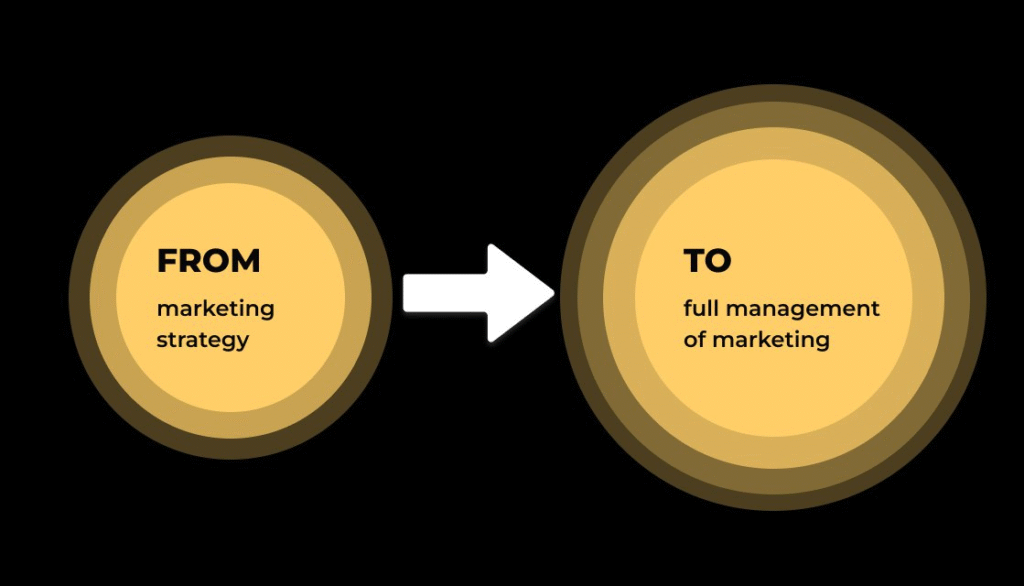
We started working with Safelogic to develop a marketing strategy. At the time, we had an ambitious goal
“We want to increase the number of medium-sized customers (from 2 to 49 containers per month) and gradually transfer customers to the premium class (50+ containers), but we don’t know how to do it exactly.”
💡 Safelogic is a company that knows logistics perfectly. They transport goods around the world, offer comprehensive solutions and work quickly and efficiently.
After the strategy was developed, the client was delighted and decided to start implementing it immediately. We like this approach)
But before we could start working together as a full-fledged marketing department, we received a message from a client:
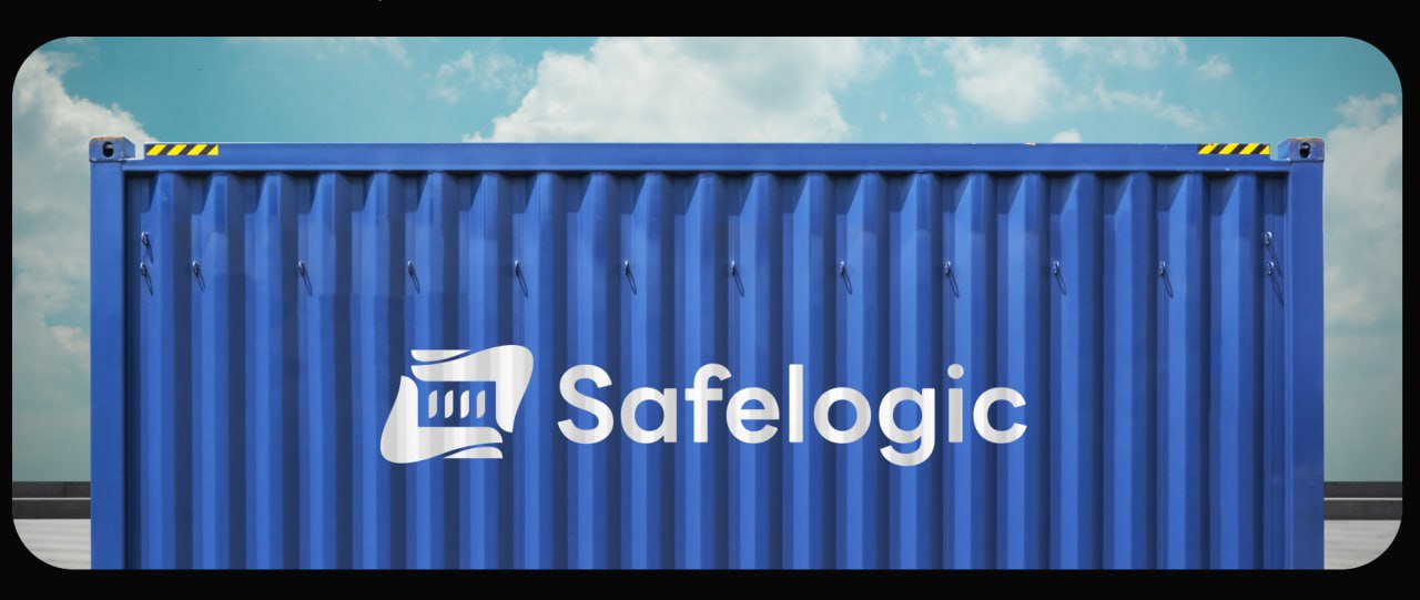
“I’ve managed to arrange for our logo to be placed on the football jerseys of a local team. Can you make the logo by next Wednesday?
Such a message in the morning evokes a range of emotions: on the one hand, it’s nice, because the client is actively working on developing their brand and looking for new ways to promote it. On the other hand, it is a challenge, because the standard process of developing a brand book takes several weeks, and we had less than a week.
Typically, a brand book contains:
- Logo (main, alternative, monochrome versions).
- Rules for using the logo (minimum dimensions, prohibited variations).
- Corporate colours (main and additional palettes, their use).
- Branded fonts (main, additional, rules of use).
- Icons and graphic elements.
- Document templates (presentations, commercial offers, letters).
- Business cards, letterheads, envelopes.
- Options for correct and incorrect use of brand elements.
Since it was the logo that was urgently needed, we agreed with the client that we would make it first. And we would finalise everything else after the logo was approved and put on the football jersey.
The first stage: getting down to business
The client completed the brief in just a few hours. Such a pace is rare, and we felt the energy and a clear desire to implement everything quickly and without delay. Therefore, as soon as we received the brief, we immediately plunged into work, as if we had already seen the final result.
Second stage: it’s good that we took care of everything
Positioning — the DNA of a brand. Without it, creating a brand book is as difficult as putting together a jigsaw puzzle without a picture on the box.
The logo, colours, fonts — everything should convey the essence of the brand, its character and values. If you don’t define who we are, what we are, why we are chosen, what makes us different, and what sets us apart, your identity risks becoming just a set of random visual solutions that don’t work.
It’s a good thing that we defined a clear positioning of the logistics company at the stage of marketing strategy. This became a solid foundation and saved time for our designers. Instead of endless edits and searching for the right option, we immediately moved in the right direction.
Before we started working together, the company’s positioning looked like this:
Safelogic — safe and timely delivery of your goods to their destination..
After researching the market and conducting a comprehensive analysis of customer needs, we created a positioning in several iterations that accurately described the essence of this business:
| Safelogic — transporting containers with care for the people who are waiting for them. |
This is the peculiarity of our positioning: if we do not invent, but find the uniqueness that already exists, then we just have to transmit it. Therefore, it became the foundation for the entire visual style of the brand: colours, logo, fonts, advertising materials. We knew exactly what meanings we needed to convey and what emotions to evoke.
The third stage: development
We started with colours…
In our positioning, we have the word “care”. What colour is it associated with? What emotions does it evoke?
Warmth? Happiness? Then it’s yellow. But Safelogic is about energy, achievement, movement. Then maybe the colour orange? Bingo
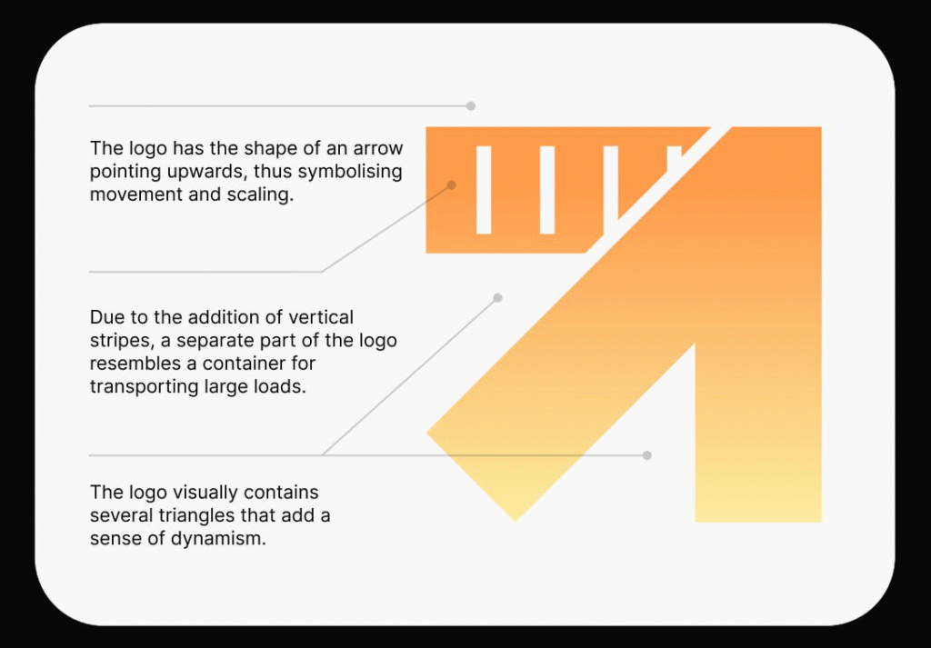
After choosing the colour, we started experimenting with the first letter “S”, which was one of the options for styling the logo. Its shape made it possible to integrate visual images of routes, containers and movement. We tested minimalist, geometric and dynamic solutions, looking for a balance between simplicity, recognisability and depth of meaning
We usually provide several different concepts, each of which is different from the others. Designing is a very subjective thing. That’s why we come up with 3-4 concepts, from which we choose the best one together with the client. After that, the favourite concept is refined in detail.
We will update your branding or create a new one with character and meaning.
So, we have submitted the following concepts for consideration:
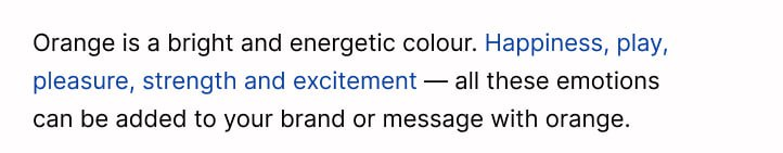
Concept 1
The 4 arrows symbolise the modes of transport: sea, air, road, rail:
Concept 2
Rectangles in the form of orange containers:
Concept 3
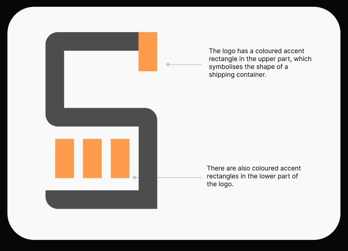
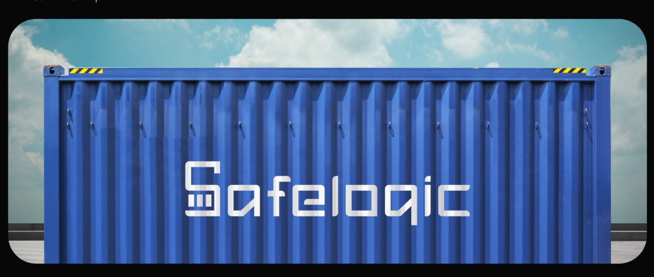
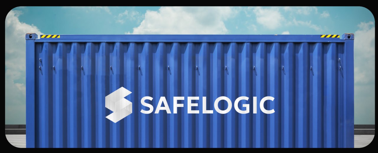
The letters “S” are made of containers, namely using their shape and visual striped texture on some parts of it.
Concept 4
Safelogic asked us to visualise the idea of hands holding a container with care. This logo demonstrates care for the customer and the cargo:

Concept 5
It is similar in meaning, but the hands in the logo mark have a geometric shape.
Concept 6
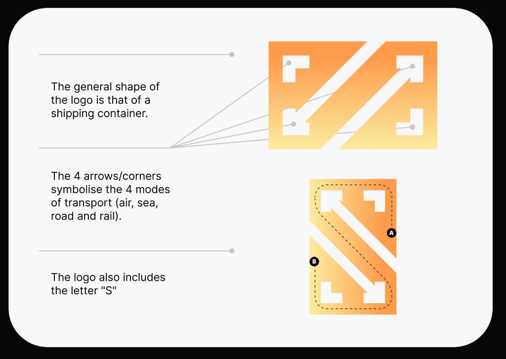
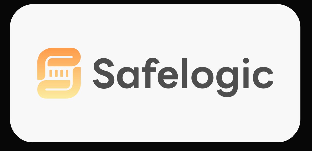
Movement, zooming, heavy loads, dynamism — the meanings we put into this logo, but this logo was chosen by Safelogic.
It was this version of the logo that everyone liked the most — both us and the client’s team.
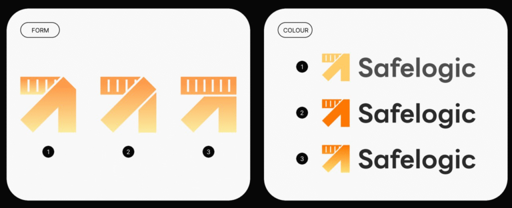
Once the basic version was defined, we moved on to experimenting with shape and colour, as well as detailing:
Conclusions
In less than a week, we developed six unique concepts, each of which reflected the brand’s essence, mission and values.
If a brand is a personality, then a brand book is its style, voice and way of expressing itself. We did not limit ourselves to creating a logo, but took care of a holistic and recognisable image:
🎨 We updated the style, making it modern and concise.
🎯 We chose colours that inspire confidence and emphasise the company’s technological capabilities.
🔠 We chose fonts that add solidity and professionalism.
📃 We developed the design of documents.
Together, these elements create a sense of reliability, stability, and a high level of service.
Now Safelogic has not just a logo, but a visual style that is memorable, inspires trust, and emphasises the company’s ambitions. When partners and potential customers see this design, they immediately realise that they are looking at a modern, professional and large-scale brand that cares about them.
If you want your brand to speak for you, be recognisable and evoke the right associations — we know how to do it, from marketing strategy to a full-fledged brand book.
Does your company need a clear positioning, visual style or effective marketing? We know which tools will work for you.