Before we dive into our work, it’s important to clarify exactly what we did. People often confuse a brand book and a logo book, thinking they’re the same. In reality, they serve different purposes:
Imagine a brand as a personality
A brand book is this personality’s wardrobe. It defines the style, behavior, communication rules, and emotional tone. It’s not just a set of colors and fonts — it’s a cohesive image that helps the brand remain recognizable in any context. For example, the brand book we created for a logistics company.
A logo book is a separate closet with uniforms. This isn’t about the overall impression, but about specific guidelines for logo usage: color options, scaling, restrictions, and technical details. It ensures that the logo won’t be stretched, distorted, or lost in visual noise.
What did we do in this case?
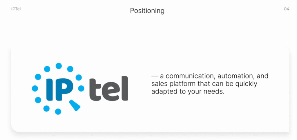
IPTel — communications, automation, and sales platform that quickly adapts to your business needs.
Our collaboration with IPTel began with the creation of a marketing strategy. We analyzed the market, competitors, target audience, and developed the brand’s positioning.
The next step was working with the company’s remote marketing department. And that’s when we spotted a key issue:
📌 The logo existed, but was used without a unified system.
📌 Brand colors were defined, but not always used correctly.
📌 The visual style lacked clear guidelines, leading to chaos in communication
Why was it necessary to create a logo book?
IPTel already had a logo and brand colors. But that’s not enough without a unified system for using them.
Imagine you have a LEGO box, but all the pieces are scattered. You might have all the necessary elements, but without instructions, you don’t know how to put them together correctly. It’s the same with a brand: if the company lacks clear rules, designers, marketers, and partners will use the logo, colors, and fonts however they like.
This leads to chaos:
📌 The logo might change shades or be scaled incorrectly.
📌 Different designers may use incompatible colors.
📌The brand style becomes inconsistent, and the brand loses recognizability.
Our task wasn’t to create something new, but to structure the existing elements, eliminate chaos, and make the identity cohesive.
Stage 1: Analysis and organization
First, we reviewed what the company already had:
- What colors were used in communication.
- How the logo was applied across formats.
- Whether there were issues with contrast and scaling.
This helped identify gaps and weak points in the visual style and understand what needed fixing.
Stage 2: Creating the logo book
2.1 Declared the positioning
Positioning is the company’s identity that must be integrated into all processes — from communication to visual style.
A key unique development of IPTel is the Voice Fake Detector — a technology protecting against voice fraud. This became the foundation for building positioning around data security, which is critically important for large companies.
We went through several iterations, tested different options, and together with the client, selected the final version:
IPTel is a communications, automation, and sales platform that quickly adapts to your business needs.
We included this positioning in the logo book so that everyone working with the brand’s visual style understands its essence and values. This helps designers, marketers, and partners align the identity with the company’s core message. As a result, the logo, colors, and fonts reinforce the right perception of the brand.
Does your brand already speak clearly?
If not, it’s time to change that.
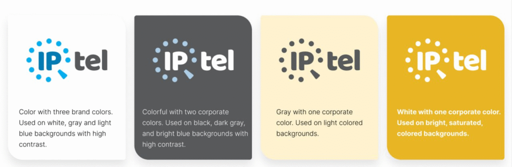
2.2 Basic versions
We have selected basic versions of the logo for different situations:
- A color version for a light background.
- A color version for a dark background.
- A gray logo for light background colors.
- A white logo for bright, rich background colors.
This ensures that the logo will always look right, regardless of the medium.
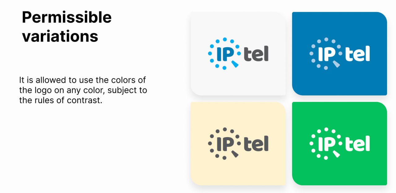
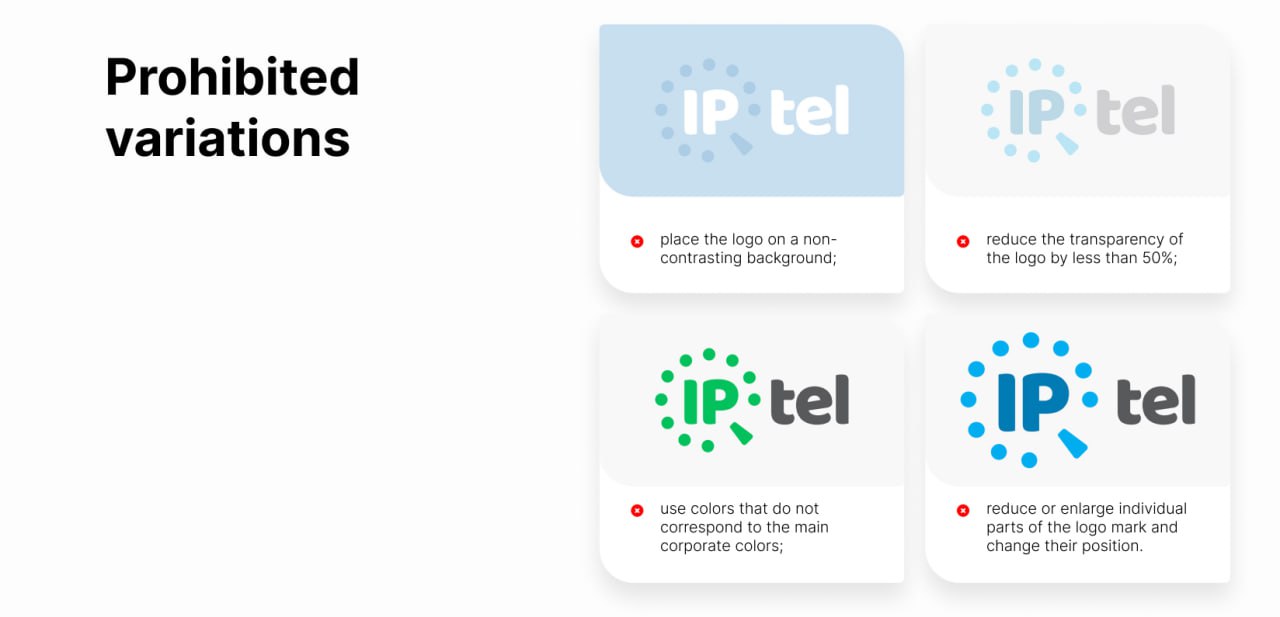
2.3 Yes / No in the logo
To avoid mistakes in using the logo, we have also defined:
✅ Allowed variations (where you can change colors while respecting the rules of contrast).
❌ Prohibited variations (where the contrast is weak, the logo is deformed or incorrectly placed).
This is especially important when a company works with different designers and contractors — clear rules help avoid chaos in the visual style.
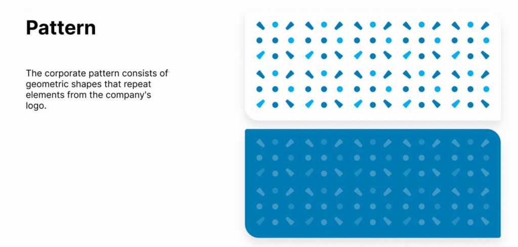
2.4 Unique imprint
To make the brand even more holistic in appearance, we created a corporate pattern that repeats the geometric elements of the logo.
Why is this needed?
A corporate pattern — like a unique brand imprint that can be used in the design of the website, social networks, advertising materials, presentations, etc. It creates recognition and makes the brand stylish and holistic.
2.5 Auxiliary colors for accents
In addition to the main colors (blue, turquoise, gray and white), we chose additional ones:
- Dark gray (Thunder) — for depth and accents.
- Green (Dark Mint Green) — for freshness and energy.
- Yellow (Honey) — for emotionality and attention.
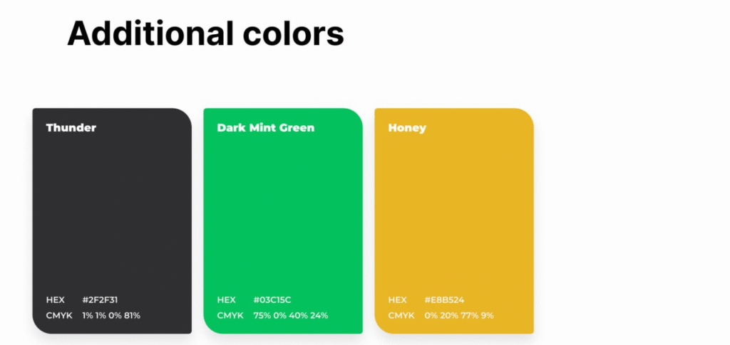
They make the design more flexible, allow for better emphasis and visual structure of information.
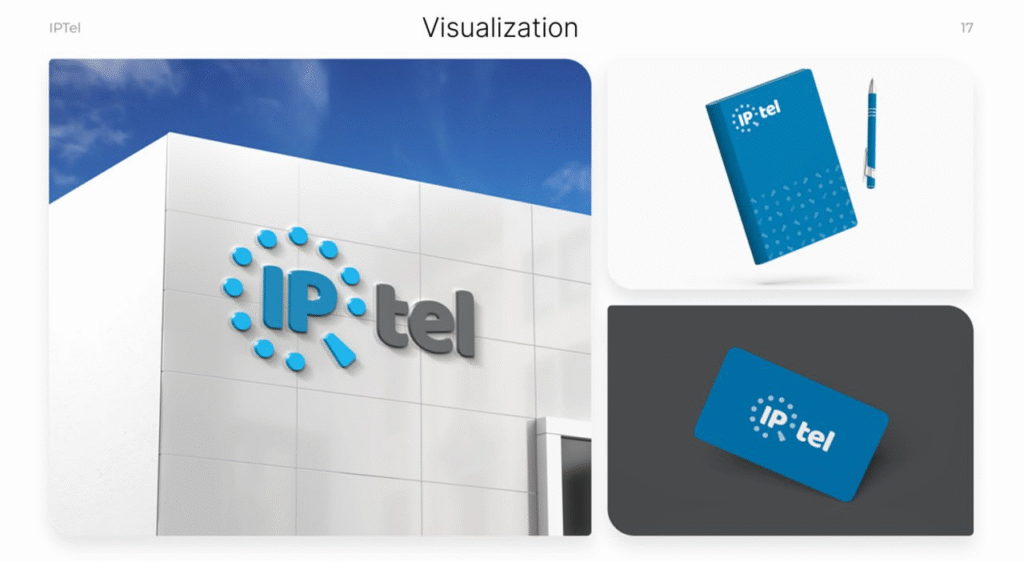
2.6 Visualization
In the final stage, we showed what the brand would look like in real situations — on the website, in advertising, on souvenir products. This will help to immediately assess how all the elements will work together.
Result: A logo book that works
+ The logo is used according to clearly defined rules, so it always looks optimal.
+ The corporate identity has become structured, not chaotic.
+ The brand has received a unique visual element — a corporate pattern.
+ Now there is a single document that regulates all the rules for using the identity.
logo book — insurance against chaos in the visual style. It allows the brand to remain professional and consistent in any situation, on any media and regardless of who creates the content.
We help brands develop: we create strategies, set up marketing and work with the visual style — from a brandbook from scratch to rebranding.
If you need to streamline the identity, build a structure or refresh the brand — we know how to do it effectively. We are waiting for your consultations!