Brand identity is not just graphic elements that are memorable and clearly associated with the company; it is a visual embodiment of business values. A company’s logo and corporate identity should not only be memorable to the client, but also convey the spirit, mood, and philosophy of the company. Especially if it is a company with many years of experience 🙂
In this case study, we will talk about creating a corporate identity for a Ukrainian company that implements CRM systems — CRM Solutions.
The CMO of the project is Serhii Soloviov.
The service is a redesign of the logo and development of the company’s corporate identity.
Case navigation:
Approximate time for case study — 7 minutes
The first stage. Consultation. Identification of project issues
We met the CRM Solutions project in the summer of 2022. This is a company that integrates CRM systems. It helps businesses automate business processes, scale up, increase revenue, and build a true customer experience.
Redesigning the logo and creating a brand identity was part of a larger process, as the client requested a comprehensive service — a remote marketing department. But in this case study, we will talk about corporate identity as a component of systemic marketing.
During the project review, we identified the distinctive advantages of the brand that had to be taken into account when creating the company:
- extensive practical experience of the company: more than 6 years of existence and more than 250 completed projects;
- the agency holds leading positions in the Ukrainian market in its niche;
- brand recognition among potential clients;
- honesty in work and adherence to internal values;
- continuous development and scaling of the company and the services it provides.
For 6 years, CRM Solutions could not exist without a logo. And of course, they had one. But over the years, it has become outdated. That’s why we built our work strategy:
- analyze the logo and identity that already exist;
- research the market and analyze competitors;
- redesign the logo;
- create a corporate identity;
- create a website following the corporate identity;
- update social networks following the new corporate identity.
The second stage. Research
We engaged a team to work on the project:
We conducted market research, offered the client to fill out a brief, and learned about:
- the target audience of the company;
- channels of communication with customers;
- brand values;
- visual elements and identity already used by the company;
- how these visual elements are perceived by the brand’s customers;
- main competitors: what is common and what is different;
- what it takes to differentiate brand from the competition.
The third stage. Creating a corporate identity
Logo redesign
A brand logo is a symbol of a company that is used to identify it among customers. We took into account that the company has over 6 years of experience. Customers know what CRM Solutions looks like and recognize the company among others. Therefore, we decided to redesign the logo that the brand had at the beginning of our cooperation.
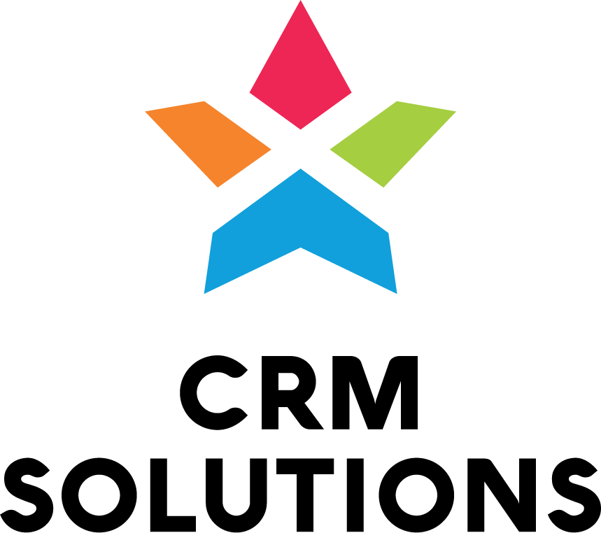
The client filled out a brief, we started working and offered several logo options.
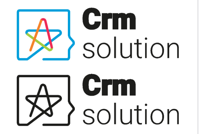
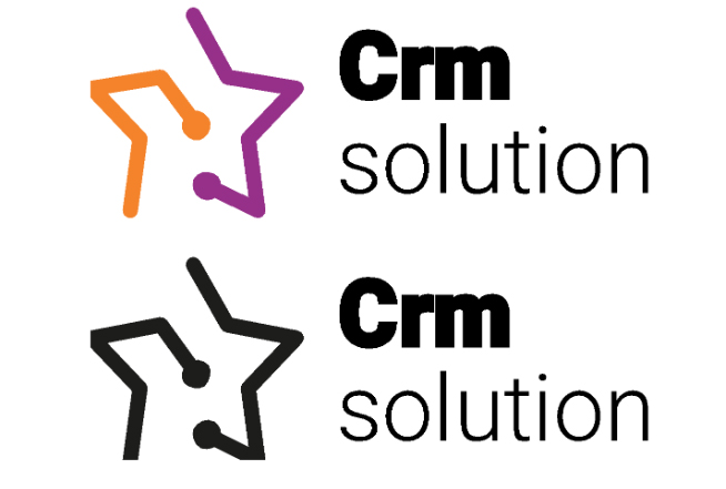


Together with the client, we chose the one that we thought best conveyed the brand’s philosophy.

Thus, we modernized the logo:
- colors became lighter, more pleasant to perceive;
- added a gradient;
- connected the elements of the star to each other.
We also identified the main colors for further work and creation of graphic elements, the main one being light green.
The work of our designer formed the basis for the creation of the CRM Solutions website.
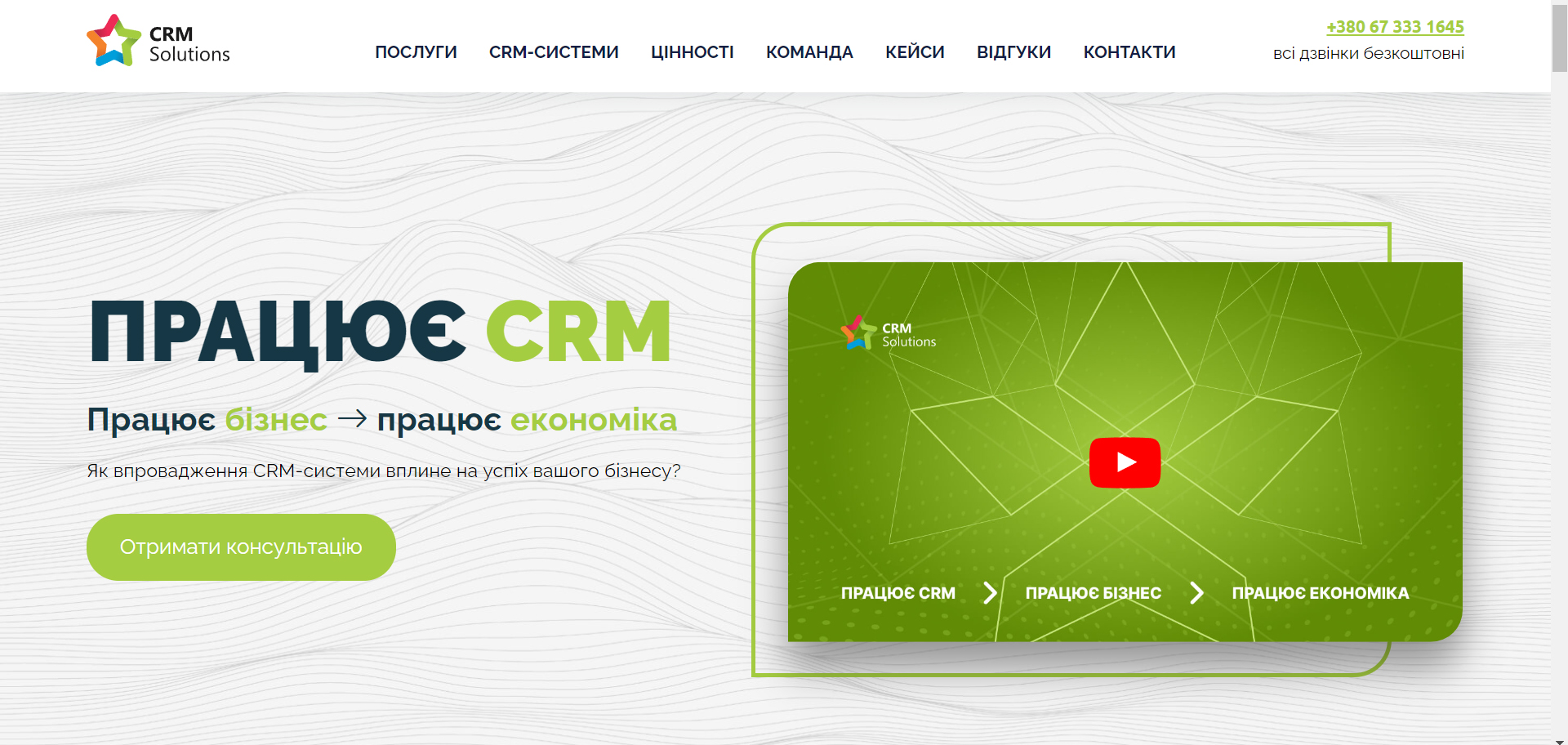
The visual content of the site was based on the idea of the transformation of a figure, a mechanism that flows from simple to complex and vice versa.
At this stage of work, we are starting to implement these developments in the design of the client’s social networks.
Conclusions
Creating a brand identity and redesigning a logo is never an easy task. In addition to the brand philosophy, it should convey to the end user that changes in the company are for the better: the brand is growing and developing, and therefore the design is changing. And with all the possible modifications: from changing colors and graphic elements to creating a completely new logo, it should convey the values, approach to working with clients, and brand philosophy. Both we and the client believe that we did a great job.
We updated the logo for CRM Solutions and created a corporate identity that became the basis for the visual design of the website, social media, and creatives for advertising campaigns.
This is just the beginning! We continue to cooperate with the client, so we advise you to subscribe to our social networks and email newsletter so you don’t miss the most important news from the world of marketing and Solve Marketing!


