Hello!
My name is Ruslana, I’m a content marketer at Solve Marketing. Today I talked to our team to find out how to choose a palette for your corporate identity.
- What is corporate identity and what does it consist of?
- Why is it important for every company to have its own corporate identity?
- Briefly about the psychology of colors.
- Examples of using colors for a particular business niche.
Violetta, Head of PM:
Corporate identity is a system of symbols and colors, the purpose of which is to distinguish a brand, to create its memorable visual image.
Elements that make up a corporate identity:
- logo — a unique brand symbol;
- corporate colors;
- typography — fonts, font sizes.
All these elements should be recorded in one document — the company’s brand book. This is a set of rules that describes all the elements of corporate identity and the rules for using these elements. For example, on which backgrounds the logo can be placed and on which it is prohibited.
Why do you need a corporate identity?
Kateryna, COO of Solve Marketing:
The goal of developing a corporate identity is to create a unique visual image of your business that your customers and partners will remember.
The corporate identity reflects the main ideas and goals of the company, and builds an associative connection between your business and the client.
Corporate identity is used for the following purposes :
- to make the brand recognizable: corporate identity helps to create a visual connection between the brand, its products, and the client;
- to stand out among competitors: corporate identity helps to position and emphasize the unique features of your company.
The corporate identity is used on the website, in the design of social networks, letterheads, employee uniforms, on company souvenirs, i.e. everywhere.
Even advertising banners should convey business ideas and be designed in the corporate style.
What role does color play in corporate identity and marketing?
Kateryna, COO of Solve Marketing:
This is a good question. One of the most important ones!
For effective advertising, it’s important to choose a color that will promote the emotion the brand needs or attract people who are already in the right emotional state. And emotions, as we know, directly influence the decision-making process.
In the mid-20th century, Max Luscher discovered the relationship between emotional state and color perception: depending on one’s emotions, a person becomes attached to some colors, others may not be perceived at all, and still others will irritate them.
Let’s learn more about the meaning and associations with each color.
White is the color of openness. It does not cause any unpleasant sensations, it is neutral. That’s the danger of using it: information on a white background, such as an announcement, can go unnoticed because there are no accents. That’s why white is usually used with a contrasting background and, thanks to its versatility, in any niche: from cars to clothing brands.


Black is a complex and deep color, a color of self-reflection: it helps to concentrate on solving a particular task.
It is associated with solidity and wealth.
It is used in “expensive” niches — cars, clothes, cosmetics. It is often used together with white.

Red is a bright color, which attracts attention. In addition, it can cause a person to have a strong desire to make a particular choice, for example, to buy an advertised product. The first association with the color is “attention, act now.” That is why many ads and banners about discounts and sales are made using red — there is no chance of passing by. However, it is better to use this color as an accent color, rather than the main one in the corporate style. Thus, a small detail of the ad, highlighted in red, will be appropriate and will immediately attract attention, while its excessive use can lead to irritation.

Orange is the color of positive and optimism. This color can be used in “complex” niches, such as medical, educational, food and communication. Orange adds activity, but at the same time gives a sense of inner balance and spiritual harmony.

Yellow is primarily a color of openness and sociability. It also has calming properties — it helps to calm emotions and find inner balance. This color will be successful in advertising children’s products, travel agencies, taxis, and advertising and PR agencies.


At Solve Marketing, we also chose yellow because we are always open to new things: ideas, contacts, and projects. Internal balance helps us to systematize complex things and talk about them in simple words.
Our main service is a remote marketing department, and the company’s goal is to help clients become leaders in their markets.
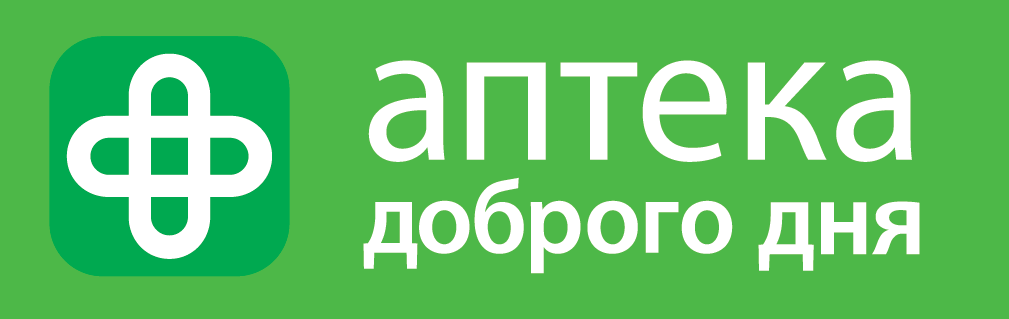
Green is the color of freshness, calmness, and relaxation. It is associated with healing and health, which is why pharmacy chains often use it in their branding.
Green is often actively used in advertising and branding of dental clinics, health and environmental centers. In addition, clothing brands and coffee shops use green.

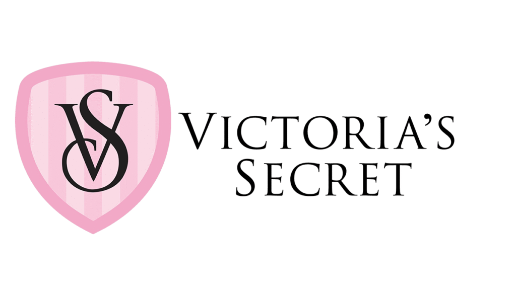
Pink is the color of youth and love. It is characteristic of niches connected with personal relationships: it enhances feelings, makes us more attentive, affectionate and responsive. This includes perfumery, products for women and children, and the services of marriage agencies.


Blue is the color of trust, stability and fundamentals. Many retail chains and banks use blue in their branding to associate themselves with a reliable partner who is always there for them.


Purple is the color of inner focus, which stimulates the brain and helps to solve creative problems. It is actively used in the gaming and cryptocurrency niche.

Using knowledge of color psychology, you can transform your company and create the right brand image in the eyes of consumers. However, choosing the perfect colors for your logo, packaging design, or landing page can take a lot of time. In any case, it doesn’t have to be a sudden decision.
Interested in developing branding for your business? Contact us for a consultation and we’ll help you choose the right solution for your needs.