Business enquiry
Jerold — is a start-up in the field of fintech and trading. Its product is artificial intelligence that generates trading signals and helps traders make decisions on the market.
At the time the project was launched, the business model had not yet been validated by the real market. The team faced a key challenge: to test demand and build a stable stream of registrations from paid traffic.
The client had a clear request:
- receive the projected number of registrations every day;
- scale traffic without losing lead quality;
- avoid the risk of advertising accounts being blocked (financial topics, subscriptions, regulatory restrictions).
To do this, it was necessary to create a conversion landing page that:
- quickly explains the value of the product;
- builds trust in a high-risk niche;
- corresponds to the policies of advertising platforms;
works as a performance marketing tool, rather than as a “startup’s calling card”.
I. The role of the marketer and the design stage
This project is an example of why a high-quality landing page does not start with design.
A page created without marketing logic may look aesthetically pleasing, but it will not work as a tool for attracting customers, scaling advertising, and testing business hypotheses.
This is especially critical for start-ups: every misstep in structure, messaging, or UX directly affects lead cost, market testing speed, and audience trust.
Before developing the page, the marketer conducted CSD / Customer Development research:
- analysis of demand and trends in English-speaking and Russian-speaking markets;
- research into the behaviour of novice and professional traders;
- analysis of competitors, their websites, traffic, and positioning;
- audit of the existing website and user journey.
💬 For businesses, this does not mean “making another landing page,” but rather understanding who exactly is buying the product, what they are willing to pay for, what fears need to be addressed before the first click on the button, and what mistakes can “eat up” the advertising budget.
Key insights:
💡 Trading — a market with low trust levels, where users quickly spot “scams”.
💡The decision on registration is made within the first 20–40 seconds.
💡Critical transparency: team, legality, subscription terms, disclaimers.
💡 Mobile UX takes priority over desktop.
💡 Advertising platforms have strict requirements for financial products.
How a marketer turned insights into solutions
Based on research, the marketer:
- formed the structure of the conversion landing page;
- defined key messages and offers;
- set requirements for UX, content, and legal blocks;
- designed the page for paid traffic and scaling.
This approach allows businesses to avoid chaotic website redesigns after advertising launches, reduce the risk of advertising accounts being blocked, quickly achieve stable lead costs, and lay the foundation for scaling.
II. Landing page structure: conversion logic
The landing page was built as a sequential decision-making scenario, where each screen removes a specific barrier and pushes the user to the next step.
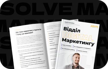
Visual implementation of the Jerold landing page
💡For businesses, this means a controlled customer journey rather than random behaviour. You don’t just get traffic — you control how people think, doubt, trust and make decisions.
1. “Is it about me?”
Quick identification of the target audience:
- for beginners — simplifying the start;
- for experienced users — enhanced analytics and faster decision-making
This block reduces the bounce rate and increases the effectiveness of every advertising dollar.
2. “How does it work?”
A simple explanation of how AI signals work, without technical overload.
In complex products, the main enemy is misunderstanding. The faster the customer grasps the logic of the service, the lower the barrier to registration and the higher the quality of the lead.
3. “Why can I trust?”
Trust blocks:
- information about the product and the team;
- legal transparency;
- social evidence;
- real-life usage scenarios.
Especially in financial and technological niches, trust is a conversion factor. Lack of transparency directly increases the cost of a lead and reduces the scalability of advertising.
4. “What will I receive?”
Benefits instead of promises of income:
- time savings;
- systematic decision-making;
- reduction in emotional errors;
- ease of integration into the trader’s daily work.
We deliberately removed aggressive financial promises in order to build long-term loyalty rather than short-term conversions with high bounce rates.
5. “What are the terms?”
Transparent subscription logic, cancellation option, and no hidden conditions.
Transparent conditions reduce the number of negative comments, returns, and blocked advertising accounts, which directly affects business stability.
6. “What are the risks?”
Disclaimers that comply with advertising platform policies:
- the service does not guarantee profit;
- this is a tool, not financial advice;
- confirmation of agreement with the terms and conditions.
This is an element of business protection: reducing regulatory risks, stability of advertising campaigns, and reputation control.
7. “What is next?”
Clear CTAs for registration, connecting to the service, and remarketing.
It is important that each CTA is designed as part of the funnel and natively integrated into the content. This allows you to scale traffic without chaos.
III. Content: how to remove the barrier of mistrust
The content was developed based on interviews with the team and analysis of typical questions from potential customers.
Main focus:
- get rid of the feeling of “yet another trading scam”;
- speak the language of utility, not hype;
- explain complex things through examples and scenarios;
- emphasise the reality of the product, not the illusion of easy money.
Special attention is paid to FAQs and legal blocks — as elements of conversion, not formalities. A well-thought-out FAQ often removes up to 30% of objections even before contact with sales.
IV. Design and UX
The visual concept was built around three principles:
- readability and quick scanning;
- neutral, non-aggressive fintech aesthetics;
- focus on trust rather than emotions.
UX solutions:
- clear hierarchy of blocks;
- minimum distractions;
- mobile logic as a priority;
- quick access to CTA;
- clear navigation without overload.
Each UX solution optimises information perception and reduces decision-making time.
V. Preparation for the launch of paid traffic
The landing page was immediately designed as part of the performance system:
- UTM tags configured;
- readiness for integration with CRM;
- accurate event analytics;
- compliance with advertising platform policies;
- readiness for remarketing.
VI. Launch and optimisation
After launch, the page was used as a base for:
- testing hypotheses based on the offer;
- conversion optimisation;
- scaling of paid traffic;
- improving lead quality.
A website is a living system that grows alongside your business.
💡 Landing page under the guidance of a marketer
In the Jerold project, the website served as:
- business hypothesis testing tool;
- foundations for paid traffic;
- lead quality filter;
- the foundation for scaling a start-up.
This is an example of how visuals, UX, and marketing work as a single system rather than separate artefacts.
Is your website currently growing or merely existing?
Most businesses lose money not because of poor traffic, but because of weak website logic: unclear offers, lack of trust, chaotic UX, and zero analytics.
At Solve Marketing, you will be working with a team of 35+ specialists, who build websites as part of a marketing system: from strategy and customer development to advertising, analytics, and scaling.
🎯 Sign up for a free consultation with a marketing specialist, and you will receive:
- an honest assessment of your website or product idea;
- understanding how to increase conversion and reduce lead costs;
- strategic vision, not “cosmetic changes”;
- clear next steps for growth.
A beautiful page is nice. Controlling customer flow is business.
👉 Sign up for a consultation.